First impression
The gut reaction
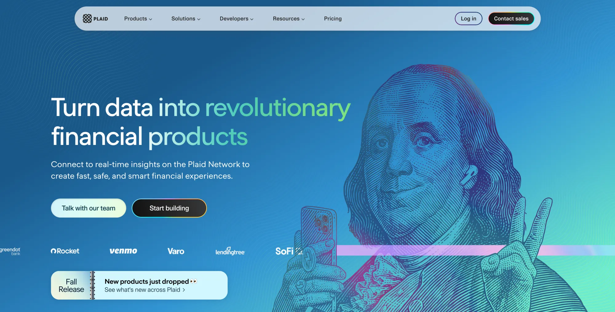
Okay, the first impression I have here is that this is a very unique, tasteful, smart, colorful, bold design. I really like how these lines are kind of like replicating the same pattern that you often see on banknotes, where they have like these curved lines very subtly in the background, curved thin lines. I don't know what that pattern is called, but to show the kind of the authenticity of a banknote, to make it more difficult to forge a banknote, they add these very subtle curved lines in the background as a pattern. So they do that, and then they kind of take the same printing style as on US banknotes with the same characters. We have George Washington and Jefferson and all of these people on there, but it's not just exactly those. They kind of have a pose. Like, one of them is holding an iPhone and he gives a peace sign. He has a cell smile and he wears AirPods. And that immediately makes it very approachable, and it gives me a friendly company. It immediately makes me think the people behind this are nice, friendly people who really know their shit. They're smart. They're fucking smart. And this is a great product that you can trust.
The colorfulness is something in this sector I find very, very bold but at the same time subtle and tasteful.
Decision 1
Why it works
So immediately my first decision here is it almost like makes me notice, makes me smile, makes my eyebrows go up with a slight sense of delightful surprise that this is what I get. There's something about the face, the human face with a slight smile, that is so familiar, but at the same time modify in a way where they make it theirs. So smart.
And then that pink line, that pink horizontal line emanating from the iPhone he's holding in his hand also signifies something, and I'd like that it goes out of this iPhone but then is behind his hand that's making the peace sign, which gives it a sense of space. And it tells me, oh, there's some kind of data transfer happening, I guess.
And then the color shading. I just think it's so wonderfully done. It's so on point. So unique.
colorful border around main CTA
Detail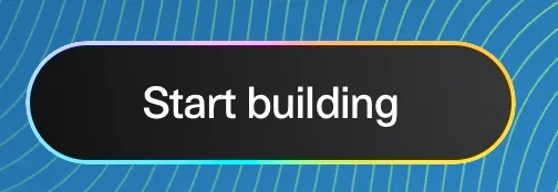
Why it works
And then their main call to action is just a black background button with a white text on it. Very easy to read, very clear. But then they add this border around it that is a couple of pixels thick. And instead of giving it one color, they give it, it's kind of like a fade of a color palette and it goes around it, and it's not static, it actually moves. It has a glow that's kind of circulating around it, and it makes it look very organic and a bit playful and friendly without getting in the way. It's very subtle.
organic color palette fade on hoverstate
Detail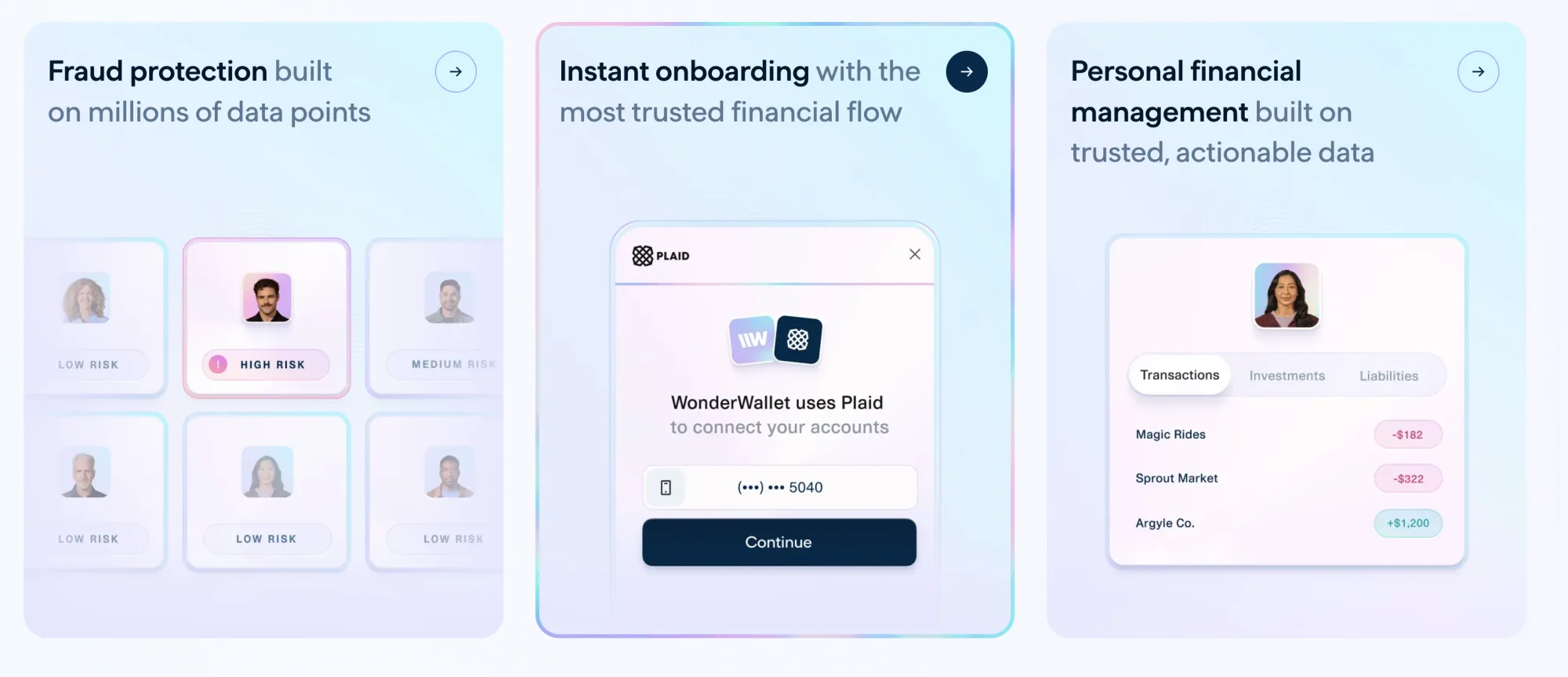
Why it works
And then this colorful color palette fade, I don't even know if that's what I want to call it. It goes around, like when I select one of these tiles, then it creates that effect around that tile as a kind of interactive element. And again, it's kind of moving or circling around the main element or the element that is selected here in a very organic way. So it creates now the sense of both the lift, little surprise effect, as well as familiarity because I've seen it before. It's a very pleasant interaction. Feels like a very pleasant interaction.
Decision 4

Why it works
And then I really like the way this element here or this module here looks in terms of colors. I like the choice. I like this deep dark blue with the light blue organic wavy lines in the background.
And then that image that again looks like it's on a US dollar note of, I think it's Thomas Jefferson, but again he's smiling, kind of knowingly looking at you as if you're kind of in on some deal, and that gesture tells like it's kind of like yeah you get it. We are in the know. And again he wears a smartwatch which is out of the time, out of his historical context. It's just cool.
And then the typography is, it's kind of futuristic but very clear and simple and clean. And here the CTA button, usually the main CTA is like black background white font. Here they inverse it because it's a dark background, so it's white background black font. But it still has that circulating color fade border around it. Very well done. Very very well done.
Decision 5
Why it works
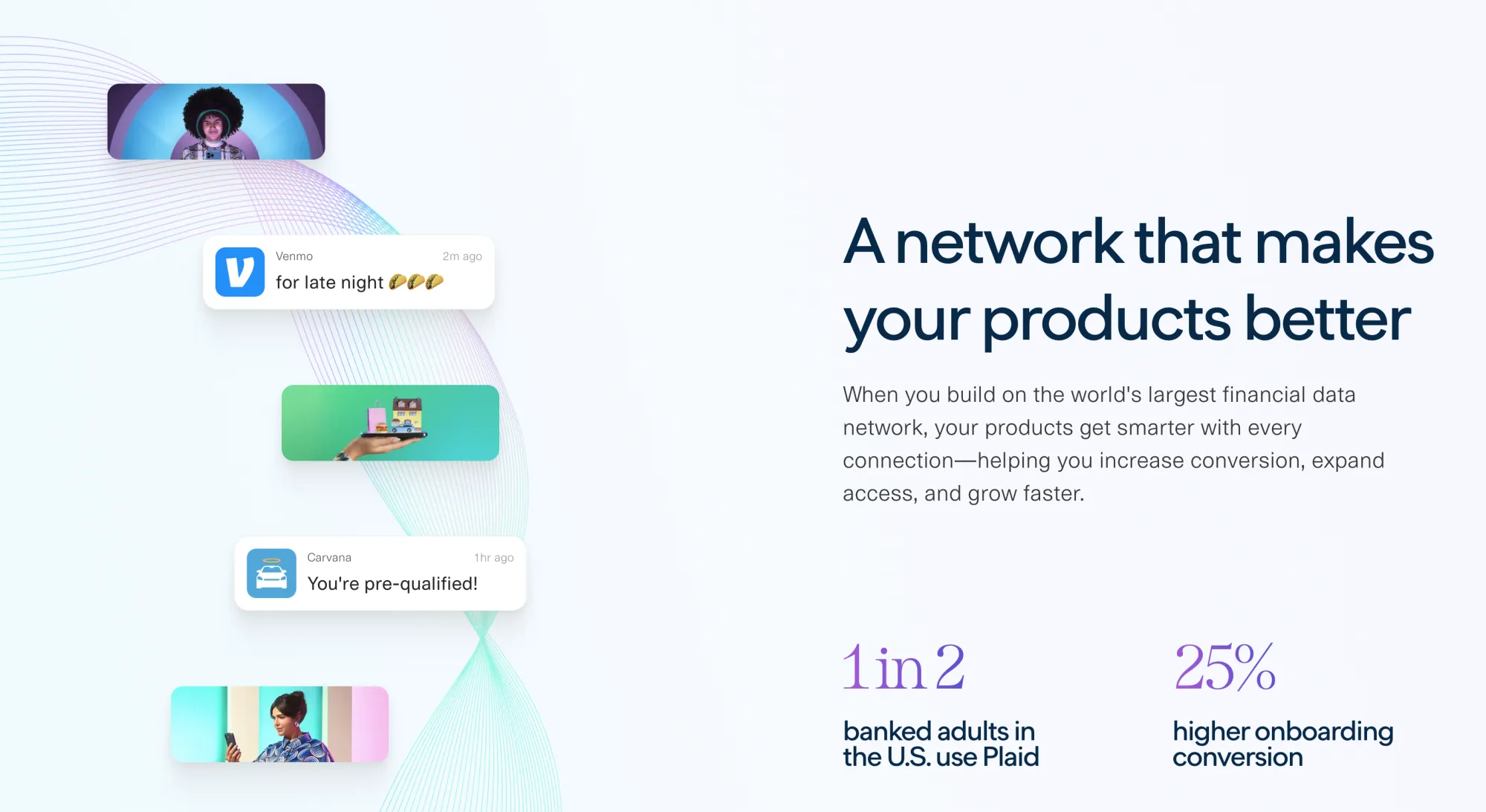
And what they do here I found also quite interesting, because it's almost like a pattern interrupt, where on the left side you again see these organic lines that again are kind of inspired by these background patterns that you see on banknotes commonly, to make forging them more difficult. And it has this very precise aesthetic, harmonic feel to it, and the way it is placed. And then there's like these other elements overlaid to it that kind of tell a story, right?
You see this character, it looks like something out of some kind of movie but also human. And then you see there's like Venmo for late night talk, tacos two minutes ago, then you see a hand that has on a tray, but the tray is actually I think a phone, an iPhone, and then on it there's like a car, a house, a shopping bag, a burger. So basically everything in life you get the idea can be paid with that.
And then the next one is Caravana, where it tells you you're pre-qualified an hour ago. Notification, a notification, and then underneath that you see that woman holding the phone, looking at the iPhone in her hand, and again the colors, the style, everything. It's real, but it's also slightly futuristic, aspirational. It looks fun, it looks cool. It looks like you're living in a cool futuristic world. And then on the right side of it, they have the messaging.
And again, I like the fonts also that they use for the numbers of the elements here. That they use for 25%, that they use for 1 in 2. It just again makes it so much more friendly and accessible and fun for a financial product without making me feel like they are not serious, they are not competent. No, I feel like they are absolutely capable and competent. But at the same time they have taste, they have fun, they get it.
Decision 6
Why it works
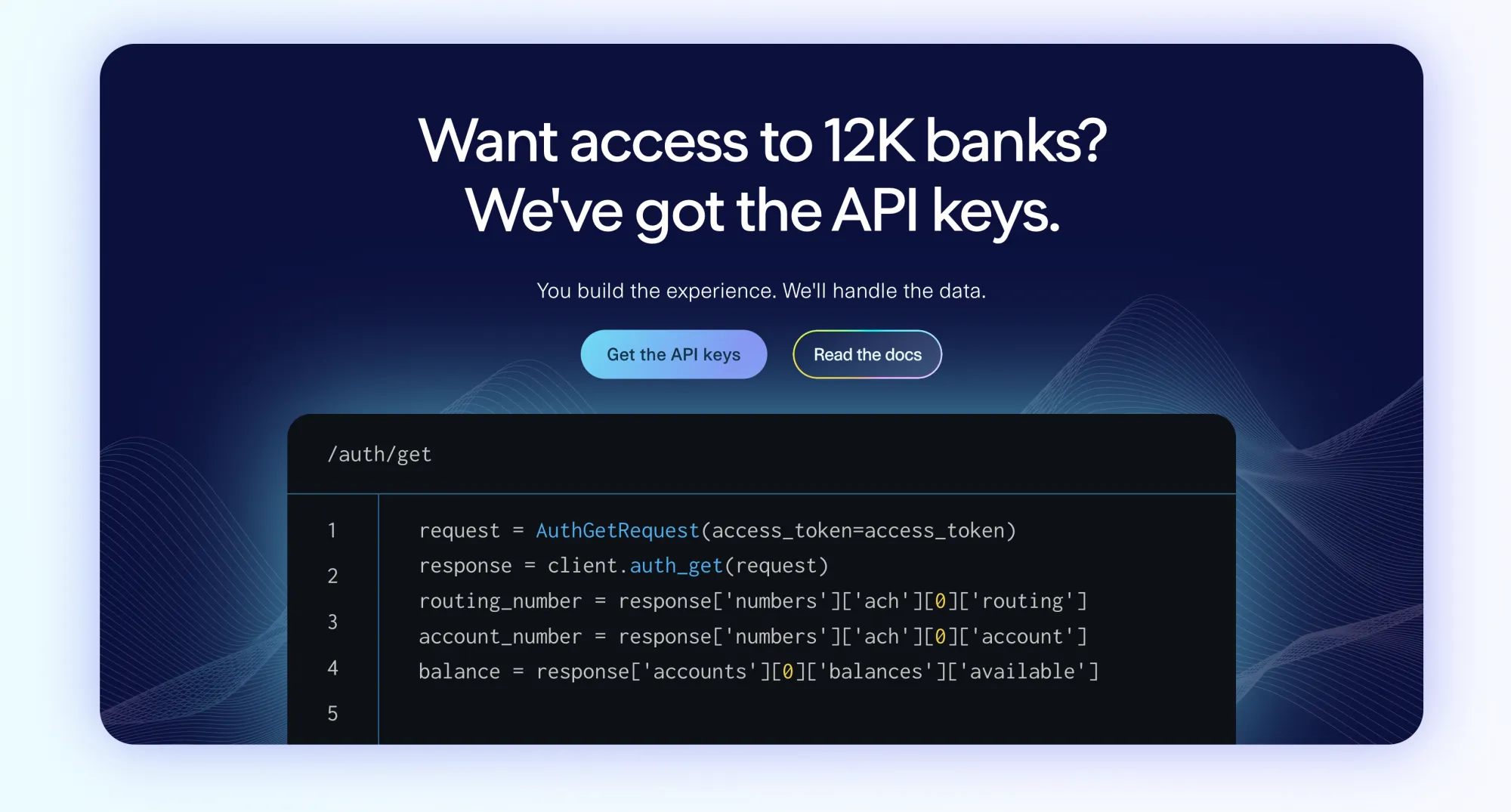
And then here also another great element. Again, you know, the part, the last one was very light, and then this one is going very dark again. Dark blue, and then the main element on that thing is kind of this black terminal screen with very technical things. Immediately a developer sees, oh yeah, this is what I want, right?
The choice of the two buttons here very well done. Here the button is actually has a transparent background, white font, but then again that color fade pulsating CTA and these wavy lines in the backgrounds are moving slowly, subtly. It again creates the sense of organicness of this, something going on behind, something is in motion, but it's very harmonic and organized by a higher entity almost. It's beautifully done, and then yeah, the terminal also is just a beautiful font and color choices.
Decision 7
Why it works
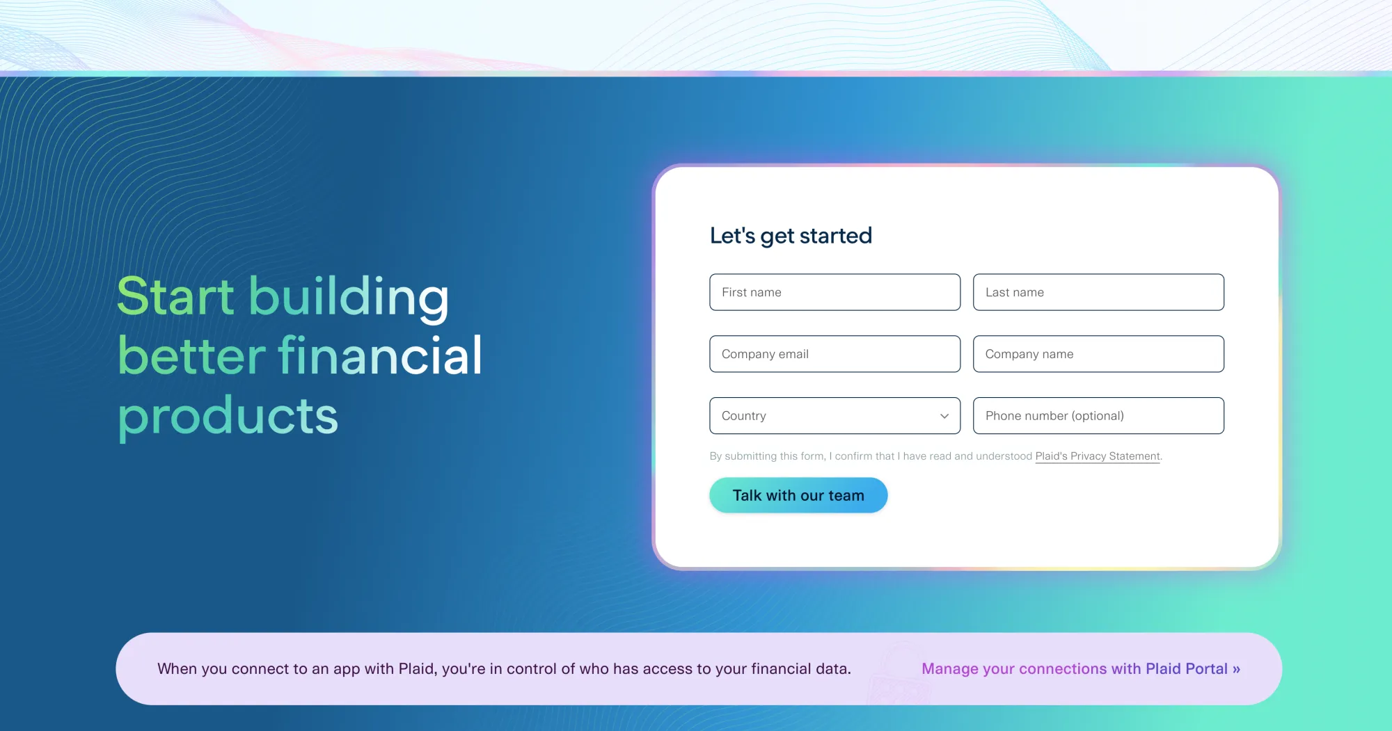
So and here this is kind of their, towards the bottom of their page, their contact form CTA, and I think it's beautifully designed. It makes me almost, like, just by the way it looks, it almost makes me want to fill out the form, which is so well done. I like that. It has so much space. It has these rounded corners. It doesn't feel like it's cramped in. It seems something that is very doable, right?
Usually a form looks like, I gotta deal with this. This one looks like, ooh, this looks like it almost pulls me into it. I almost want to do it in a positive way. White background, clear white font, lots of spacing around each field. And it's very clear. It's like six things I put into it, and one of them is even optional.
And again, this one also has this color fade border around the box with a white background. And then this entire element here has a nice friendly blue hue faded color, and again with these woven subtle lines. And at the top of it there is a straight horizontal border line that has the same color fade pastel aesthetic as we typically have around the main CTA button. And also that the text element on the left is not just white font, but it is white on the left and then it fades into this colorfulness towards the right without becoming less readable. It's just so well done.
System
How it is built
Estimated from screenshots by Claude on Oct 19, 2026. Check against the live site.
Type
| Role | Family | Notes |
|---|---|---|
| Display | Geometric/grotesque sans similar to Plaid's custom face, close to Inter Display or Plus Jakarta Sans with a slightly humanist feel | Hero headline approx 64-68px, regular to light weight (~400), sentence case, tight tracking (about -1 to -2%), line-height ~1.1. Gradient text fill from white through aqua to green on key words. |
| Section heading | Same geometric sans | About 48-52px, regular weight, white on dark panels, sentence case, tight leading (~1.15). |
| Card title | Geometric sans similar to Plus Jakarta Sans or Inter | About 24-26px. Semibold navy lead phrase followed by regular-weight muted slate-blue continuation in the same sentence. Sentence case. |
| Body / UI | Geometric sans similar to Inter | Body about 20px regular in white on the hero. Nav, buttons and labels 14-16px, medium weight. Tiny all-caps risk labels about 11-12px with wide tracking (~8-10%). |
Color
- #1190DBBackground (hero blue gradient mid-tone)
- #0A3F7ABackground (deep navy gradient in dark banner, dark end of hero)
- #CFF5FFSurface (pale cyan card and pill fills)
- #F4F7FFPage background between sections
- #FFFFFFPrimary text on dark, nav pill tint
- #0B2545Text and primary dark buttons (navy)
- #3EE6B0Accent (mint/green gradient end, text highlight)
- #E9A8E8Accent (pink/lavender glow on card borders and light streak)
Spacing
Generous whitespace: the hero text block sits about 128px from the left edge with about 24-40px between headline, subcopy and buttons. Cards have about 24px internal padding and about 30px gutters between them.
Layout
Floating rounded nav pill centered at the top, then a left-aligned hero text column over a full-bleed gradient with a large engraved portrait on the right. Below that, a logo strip, a promo banner, and a three-column equal-width card grid, followed by a full-width dark rounded banner with text on the left and illustration on the right.
Shape
Heavy rounding: pill buttons and nav (fully rounded), cards and banners with about 20-28px radii, and inner UI mockups with about 16px radii. Cards use thin 1-2px gradient borders (pink, lavender, aqua) with soft glows, and shadows are very soft and diffuse. Primary buttons are dark with a thin rainbow gradient outline.
Notes
Distinctive imagery: banknote-style engraved portraits (Franklin, Lincoln) recolored in blue/teal/magenta duotone, modernized with AirPods, phone and smartwatch bearing the Plaid logo. Subtle topographic wavy line textures sit on the blue backgrounds. The UI mockups use frosted-glass, pastel pink-to-cyan surfaces. The overall feel is airy, polished, fintech-premium and low density. Hex values and font sizes are visual estimates from screenshots, and the typeface is a best guess.
The principle
Take the thing that's most familiar and related to your offer, and then make it yours. Give it your own style, give it your own character and personality, translate that into something visual, and then remake the familiar thing based on that, and use that as a consistent theme throughout your entire design. In this case, Plaid is a financial solution, and for them they took banknotes, US banknotes, as the familiar thing, and then gave them their own character, their own personality, and built the entire design system on that. And it's beautiful, and it's familiar, but unique. It's delightfully surprising.
More decisions ➤